
Packaging Design
Your packaging needs to grab attention, demand top of mind positioning, and be functional - while telling your brand story.
Case Study: Lueberry Super Snacks
Intro
The Challenge
Our Approach
The Outcome
Packaging Redesign & Retail Expansion
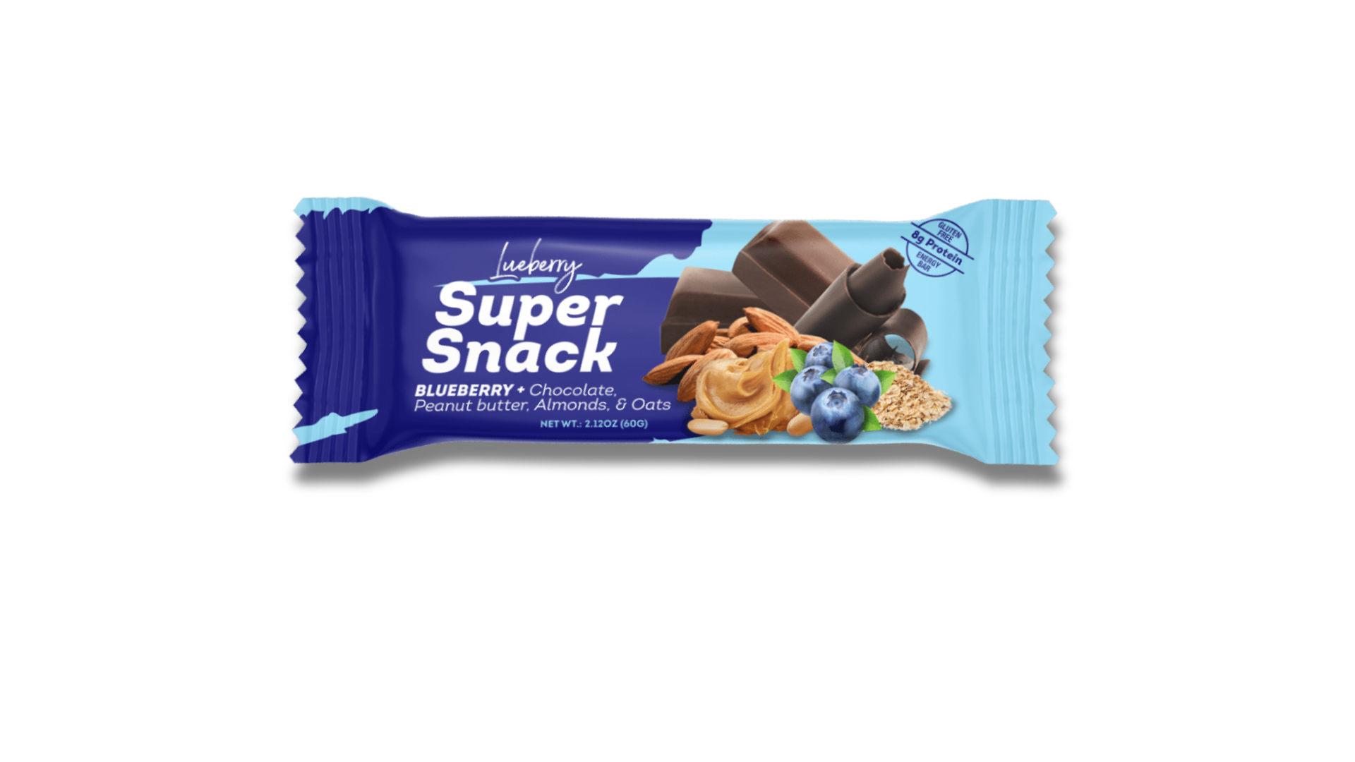
Lueberry approached Brandworx with a growing product line and a packaging system that no longer reflected the quality, energy, and shelf impact the brand needed to compete in modern retail environments. The original packaging relied heavily on ingredient imagery and lacked a unified visual system that could scale across SKUs, multipacks, and in-store merchandising.
Our objective was to create a bold, recognizable packaging architecture that would:
- Increase shelf visibility in crowded snack categories
- Create a stronger master brand presence
- Simplify flavor navigation across product lines
- Improve retail readiness for grocery and convenience placement
- Develop scalable packaging systems for single bars, variety packs, and shelf displays
Lueberry Super Snacks
The original packaging design featured inconsistent branding, minimal hierarchy, and limited differentiation between retail formats. While the products themselves offered strong nutritional positioning and flavor variety, the packaging lacked the energy and confidence needed to stand out at shelf.
The brand also needed:
- A more cohesive retail identity
- Better readability from a distance
- Packaging that communicated performance and functionality
- Grocery-ready packaging formats for expansion into retail distribution
- Improved merchandising systems for shelf trays and display boxes
Building a Stronger Brand System
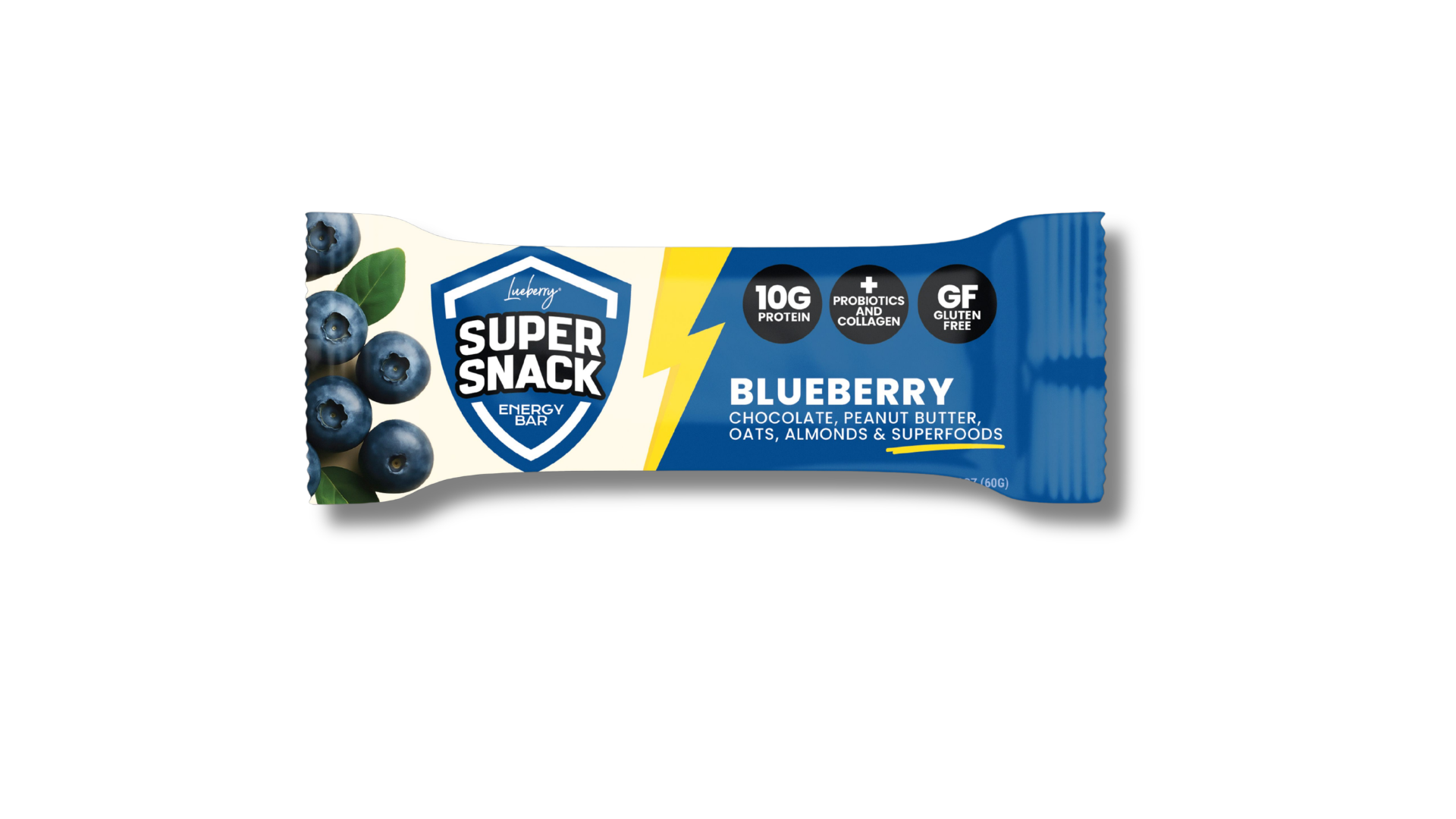
We redesigned the entire visual identity around a bold shield mark that instantly communicates strength, energy, and performance. The new system introduced a more structured brand hierarchy while maintaining the approachable personality of the product line.
Key elements of the redesign included:
- A high-contrast shield logo for instant recognition
- Dynamic lightning bolt graphics to reinforce energy and movement
- Simplified typography for improved readability
- Functional nutrition callouts positioned for quick scanning
- Flavor-led color systems for easier SKU differentiation
- Cleaner layouts optimized for both retail shelves and ecommerce imagery
The new packaging architecture gave the brand a stronger, more premium presence while creating consistency across all product formats.
Single Bar Packaging Redesign
The redesigned bar wrappers shifted the focus from cluttered ingredient photography to a cleaner and more recognizable branded experience.
The updated packaging:
- Increased visual impact from a distance
- Improved legibility of flavor names and nutrition claims
- Created stronger consistency across flavors
- Elevated the overall perceived product quality
- Delivered a more modern and athletic visual tone
The bold shield identity became the centerpiece of the system, allowing the product to stand out whether merchandised individually or within larger retail displays.
Grocery-Ready "Brick" Packaging
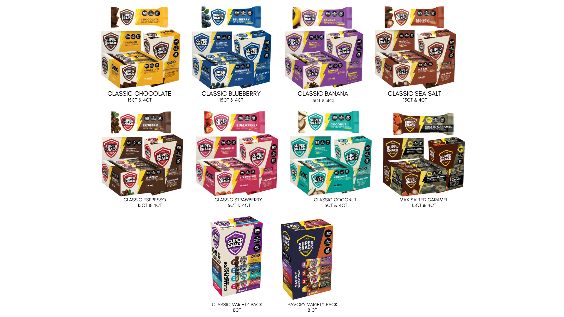
As Lueberry expanded its retail ambitions, we developed a complete line of grocery-ready multipack packaging designed specifically for merchandising efficiency and stronger shelf presentation.
4ct Flavor Packs
We created dedicated 4-count flavor bricks that gave retailers an easy-to-stock, compact format optimized for grocery shelves, club displays, and secondary placements.
Each brick maintained:
- Strong front-facing brand visibility
- Clear flavor differentiation
- Consistent nutritional messaging
- Shelf-ready structural layouts
- High-impact presentation in small retail footprints
8ct Variety Packs
To support broader retail distribution, we also designed 8-count variety packs that showcased multiple flavors while maintaining a unified brand system.
These packages were designed to:
- Encourage flavor trial and discovery
- Simplify merchandising for retailers
- Improve product organization at shelf
- Strengthen brand blocking across multiple SKUs
- Create stronger visual impact in club and grocery environments
Distinct color systems helped shoppers quickly identify flavor collections while maintaining a cohesive master brand appearance.
Improved Shelf Display Visibility
In addition to consumer packaging, we redesigned the retail shelf trays and countertop display boxes to maximize visibility and improve in-store presentation.
The updated displays featured:
- Larger branding elements for distance visibility
- Stronger contrast and flavor segmentation
- Better product exposure from multiple viewing angles
- Clear nutrition and product benefit communication
- Merchandising layouts optimized for grab-and-go retail environments
The result was a more effective retail presentation system that worked cohesively across individual bars, multipacks, and display merchandising.
The Lueberry Super Snack redesign transformed the brand from a functional nutrition product into a retail-ready packaging system built for scale.
The final packaging architecture delivered:
- A stronger and more recognizable master brand
- Improved shelf visibility across retail environments
- Consistent packaging systems across all SKUs
- Grocery-ready packaging formats for expansion
- Better merchandising performance through upgraded display systems
- A more premium and modern consumer perception
By combining strategic packaging structure with bold visual branding, BrandWorx helped position Lueberry Super Snack for broader retail growth while creating a packaging ecosystem designed to scale with the brand.
Services Provided
- Packaging Design
- Brand Identity Refresh
- Retail Packaging Systems
- Shelf Display Design
- Multipack Packaging Development
- Visual Brand Architecture
- Retail Merchandising Design
- Product Branding Strategy